鸿蒙系列--组件介绍之其他基础组件(上)
一、 ScrollBar
描述: 滚动条组件
功能: 用于配合可滚动组件使用,如List、Grid、Scroll
子组件:可以包含单个子组件
ScrollBar(value: { scroller: Scroller, direction?: ScrollBarDirection, state?: BarState })
参数:
参数名
参数类型
必填
默认值
参数描述
scroller
Scroller
是
-
可滚动组件的控制器。用于与可滚动组件进行绑定
direction
ScrollBarDirection
否
ScrollBarDirection.Vertical
滚动条的方向,控制可滚动组件对应方向的滚动
state
BarState
否
BarState.Auto
滚动条状态
ScrollBarDirection详解:
-
Vertical:纵向滚动条
-
Horizontal:横向滚动条
使用案例:
创建一个Scroller使得ScrollBar与滑动组件连接起来,且方向一致时,两者产生联动
@Entry
@Component
struct ScrollBarPage {
  private scroller: Scroller = new Scroller()
  private arr: number[] = [0, 1, 2, 3, 4, 5, 6, 7, 8, 9]

  build() {
    Column() {
      Stack({ alignContent: Alignment.End }) {
        Scroll(this.scroller) {
          Flex({ direction: FlexDirection.Column }) {
            ForEach(this.arr, (item) => {
              Row() {
                Text(item.toString())
                  .width('90%')
                  .height(100)
                  .backgroundColor(Color.Blue)
                  .borderRadius(15)
                  .fontSize(20)
                  .fontColor(Color.White)
                  .textAlign(TextAlign.Center)
                  .margin({ top: 5 })
              }
            }, item => item)
          }.margin({ left: 52 })
        }
        .scrollBar(BarState.Off)
        .scrollable(ScrollDirection.Vertical)
        ScrollBar({ scroller: this.scroller, direction: ScrollBarDirection.Vertical,state: BarState.Auto }) {
          Text()
            .width(10)
            .height(100)
            .borderRadius(10)
            .backgroundColor(Color.Red)
        }.width(10).backgroundColor(Color.Yellow)
      }
    }
  }
}
二、Search
描述: 搜索框组件
功能: 用于搜索内容输入框等应用场景
子组件:无
Search(options?: { value?: string; placeholder?: string; icon?: string; controller?: SearchController })
参数:
参数名
参数类型
必填
参数描述
value
string
否
搜索文本值
placeholder
string
否
无输入时的提示文本
icon
string
否
搜索图标路径,默认使用系统搜索图标,支持的图标格式: svg, jpg和png
controller
SearchController
否
控制器
属性:
名称
参数类型
描述
searchButton
string
搜索框末尾搜索按钮文本值,默认无搜索按钮
placeholderColor
ResourceColor 设置placeholder颜色
placeholderFont
Font
设置placeholder文本样式
textFont
Font
设置搜索框内文本样式
事件:
名称
功能描述
onSubmit(callback: (value: string) => void)
点击搜索图标、搜索按钮或者按下软键盘搜索按钮时触发
-value: 当前输入文本框的内容
onChange(callback: (value: string) => void)
输入内容发生变化时,触发回调
-value: 当前输入文本框的内容
onCopy(callback: (value: string) => void)
组件触发系统剪切板复制操作
-value: 复制的文本内容
onCut(callback: (value: string) => void)
组件触发系统剪切板剪切操作
-value: 剪切的文本内容
onPaste(callback: (value: string) => void)
组件触发系统剪切板粘贴操作
-value: 粘贴的文本内容
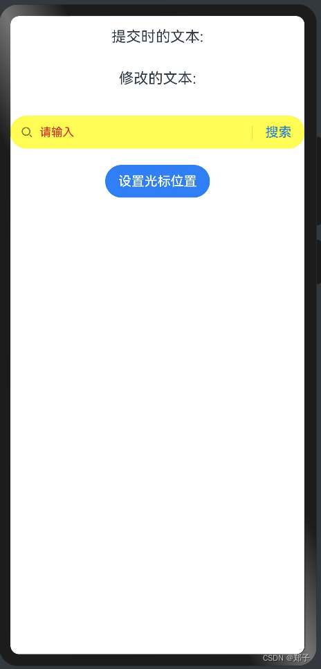
使用案例:
@Entry
@Component
struct SearchPage {
  @State changeValue: string = '';
  @State submitValue: string = '';
  controller: SearchController = new SearchController();

  build() {
    Column() {
      Text('提交时的文本:' + this.submitValue).fontSize(18).margin(15)
      Text('修改的文本:' + this.changeValue).fontSize(18).margin(15)
      Search({ value: this.changeValue, placeholder: '请输入', controller: this.controller })
        .searchButton('搜索')
        .width('100%')
        .height(40)
        .backgroundColor(Color.Yellow)
        .placeholderColor(Color.Red)
        .placeholderFont({ size: 14, weight: 10 })
        .textFont({ size: 14, weight: 400 })
        .onSubmit((value: string) => {
          //搜索框点击搜索之后的回调
          this.submitValue = value;
        })
        .onChange((value: string) => {
          //搜索框修改后的回调
          this.changeValue = value;
        })
        .margin(20)
      Button('设置光标位置')
        .onClick(() => {
          // 通过controller.caretPosition设置光标位置
          this.controller.caretPosition(0);
        })
    }.width('100%')
  }
}

三、Select
描述:下拉选择菜单组件
子组件:无
Select(options: Array<SelectOption>)
属性:
名称
参数类型
描述
selected
number
设置初始选项的索引,第一项的索引为0
value
string
设置默认文本
font
Font
设置默认文本样式
fontColor
ResourceColor
设置默认文本颜色
selectedOptionBgColor
ResourceColor
设置选中项的背景色
selectedOptionFont
Font
设置选中项的文本样式
selectedOptionFontColor
ResourceColor
设置选中项的文本颜色
optionBgColor
ResourceColor
设置背景色
optionFont
Font
设置文本样式
optionFontColor
ResourceColor
设置文本颜色
事件:
onSelect(callback: (index: number, value?:string) => void):下拉菜单选中某一项的回调。index:选中项的索引。value:选中项的值
使用案例:
@Entry
@Component
struct SelectPage {
  build() {
    Column() {
      Select([{ value: '选项一', icon: "/common/bg1.png" },
        { value: '选项二', icon: "/common/bg2.png" },
        { value: '选项三', icon: "/common/bg3.png" },
        { value: '选项四', icon: "/common/bg4.png" }])
        .selected(0)
        .value('请选择')
        .font({ size: 30, weight: 400, family: 'serif', style: FontStyle.Normal })
        .selectedOptionFont({ size: 30, weight: 500, family: 'serif', style: FontStyle.Normal})
        .selectedOptionFontColor(Color.Red)
        .optionFont({ size: 30, weight: 400, family: 'serif', style: FontStyle.Normal })
        .onSelect((index: number) => {
          console.info("Select:" + index)
        })
    }
  }
}
四、Slider
描述:滑动条组件
功能:用于快速调节设置值,如音量调节、亮度调节等
子组件:无
Slider(options?:{value?: number, min?: number, max?: number, step?: number, style?: SliderStyle, direction?: Axis, reverse?: boolean})
参数:
参数名
参数类型
必填
默认值 参数描述
value
number
否
0 当前进度值
min
number
否
0 设置最小值
max
number
否
100 设置最大值
step
number
否
1 设置滑动条滑动步长
style
SliderStyle
否
SliderStyle.OutSet 设置滑动条的滑块样式
OutSet:滑块在滑轨上
InSet:滑块在滑轨内
direction
Axis
否
Axis.Horizontal 设置滑动条滑动方向
Horizontal:水平方向
Vertical:竖直方向
reverse
boolean
否
false 设置滑动条取值范围是否反向。
false:水平方向滑动条为从左向右滑动,竖直方向滑动条从上向下滑动
true:水平方向滑动条为从右向左滑动,竖直方向滑动条从下向上滑动
事件:
通用事件仅支持:OnAppear,OnDisAppear
- onChange(callback: (value: number, mode: SliderChangeMode) => void):Slider滑动时触发事件回调。value:当前进度值。mode:拖动状态
SliderChangeMode详解:
- Begin:开始拖动滑块
- Moving:拖动滑块中
- End:结束拖动滑块
- Click:点击滑动条使滑块位置移动
使用案例:
@Entry
@Component
struct SliderPage {
  @State outSetValueOne: number = 40;

  build() {
    Row() {
      Slider({
        value: this.outSetValueOne,
        step: 10, //步长
        min: 0,
        max: 100,
        style: SliderStyle.InSet
      })
        .showTips(true) //滑动时是否显示气泡提示百分比
        .showSteps(true) //是否显示步长刻度值
        .onChange((value: number, mode: SliderChangeMode) => {
          this.outSetValueOne = value;
          console.info('value:' + value + 'mode:' + mode.toString());
        })
    }
    .height('100%')
  }
}
五、Stepper
描述:步骤导航器组件
功能:引导页
子组件:StepperItem
StepperItem
子组件:仅支持单个子组件
StepperItem()
属性:
参数名
参数类型
默认值
参数描述
prevLabel
string
-
当步骤导航器大于一页,除第一页默认值都为"返回"
nextLabel
string
-
步骤导航器大于一页时,最后一页默认值为"开始",其余页默认值为"下一步"
status
ItemState
ItemState.Normal
步骤导航器元素的状态
ItemState属性详解:
- Normal:正常状态,右侧文本按钮正常显示,可点击进入下一个StepperItem
- Disabled:不可用状态,右侧文本按钮灰度显示,不可点击进入下一个StepperItem。
- Waiting:等待状态,右侧文本按钮不显示,使用等待进度条,不可点击进入下一个StepperItem。
- Skip:跳过状态,表示跳过当前步骤, 进入下一个StepperItem
Stepper
Stepper(value?: { index?: number })
参数:
- index:设置显示第几个StepperItem
事件:
名称
描述
onFinish(callback: () => void)
最后一个StepperItem的nextLabel被点击时触发该回调
onSkip(callback: () => void)
当前显示的StepperItem状态为ItemState.Skip时,nextLabel被点击时触发该回调
onChange(callback: (prevIndex?: number, index?: number) => void)
点击左边或者右边文本按钮进行步骤切换时触发该事件
- prevIndex:切换前的步骤页索引值
- index:切换后的步骤页(前一页或者下一页)索引值
onNext(callback: (index?: number, pendingIndex?: number) => void)
点击切换下一步骤时触发该事件
- index:当前步骤页索引值
- pendingIndex:下一步骤页索引值
onPrevious(callback: (index?: number, pendingIndex?: number) => void)
点击切换上一步骤时触发该事件
- index:当前步骤页索引值
- pendingIndex:上一步骤页索引值
使用案例:
@Entry
@Component
struct StepperPage {
@State currentIndex: number = 0;
@State firstState: ItemState = ItemState.Normal;
@State secondState: ItemState = ItemState.Normal;
@State thirdState: ItemState = ItemState.Normal;
build() {
Stepper({
index: this.currentIndex
}) {
// 第一个步骤页
StepperItem() {
Column() {
Text('第一页')
.fontSize(35)
.fontColor(Color.Blue)
.lineHeight(50)
.margin({ top: 250, bottom: 50 })
Button('修改状态:' + this.firstState)
.onClick(() => {
this.firstState = this.firstState === ItemState.Skip ? ItemState.Normal : ItemState.Skip;
})
}.width('100%')
}
.nextLabel('下一页')
.status(this.firstState)
// 第二个步骤页
StepperItem() {
Column() {
Text('第二页')
.fontSize(35)
.fontColor(Color.Blue)
.lineHeight(50)
.margin({ top: 250, bottom: 50 })
Button('修改状态:' + this.secondState)
.onClick(() => {
this.secondState = this.secondState === ItemState.Disabled ? ItemState.Normal : ItemState.Disabled;
})
}.width('100%')
}
.nextLabel('下一页')
.prevLabel('上一页')
.status(this.secondState)
// 第三个步骤页
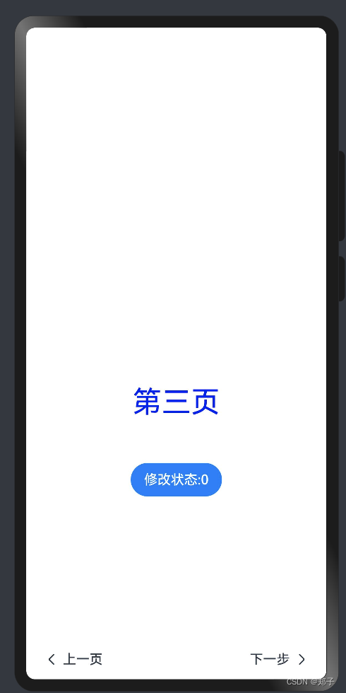
StepperItem() {
Column() {
Text('第三页')
.fontSize(35)
.fontColor(Color.Blue)
.lineHeight(50)
.margin({ top: 250, bottom: 50 })
Button('修改状态:' + this.thirdState)
.onClick(() => {
this.thirdState = this.thirdState === ItemState.Waiting ? ItemState.Normal : ItemState.Waiting;
})
}.width('100%')
}
.prevLabel("上一页")
.status(this.thirdState)
// 第四个步骤页
StepperItem() {
Text('第四页')
.fontSize(35)
.fontColor(Color.Blue)
.width('100%')
.textAlign(TextAlign.Center)
.lineHeight(50)
.margin({ top: 250 })
}
.nextLabel('完成')
}
.onFinish(() => {
// 此处可处理点击最后一页的Finish时的逻辑,例如路由跳转等
console.info('onFinish');
})
.onSkip(() => {
// 此处可处理点击跳过时的逻辑,例如动态修改Stepper的index值使其跳转到某一步骤页等
console.info('onSkip');
})
.onChange((prevIndex: number, index: number) => {
this.currentIndex = index;
})
}
}

六、TextArea
描述:可以输入多行文本并支持响应部分输入事件的组件
功能:多行文本输入
子组件:无
TextArea(value?:{placeholder?: ResourceStr, text?: ResourceStr, controller?: TextAreaController})
参数:
- placeholder:无输入时的提示文本
- text:设置输入框当前的文本内容
- controller:设置控制器
属性:
- placeholderColor:设置placeholder的颜色
- placeholderFont:设置placeholder的样式
- textAlign:设置对水平齐方式,默认:TextAlign.Start
- caretColor:设置输入框光标颜色
- inputFilter:设置输入过滤器
事件:
名称
功能描述
onChange(callback: (value: string) => void)
输入发生变化时,触发回调
onCopy8+(callback:(value: string) => void)
长按输入框内部区域弹出剪贴板后,点击剪切板复制按钮,触发回调。
- value:复制的文本内容
onCut8+(callback:(value: string) => void)
长按输入框内部区域弹出剪贴板后,点击剪切板剪切按钮,触发回调。
- value:剪切的文本内容
onPaste8+(callback:(value: string) => void)
长按输入框内部区域弹出剪贴板后,点击剪切板粘贴按钮,触发回调。
- value:粘贴的文本内容
使用案例:
@Entry
@Component
struct TextAreaPage {
  controller: TextAreaController = new TextAreaController()
  @State text: string = ''

  build() {
    Column() {
      TextArea({ placeholder: '请输入', controller: this.controller })
        .placeholderColor("rgb(0,0,225)")
        .placeholderFont({ size: 20, weight: 100, family: 'cursive', style: FontStyle.Italic })
        .textAlign(TextAlign.Center)
        .caretColor(Color.Blue)
        .fontSize(30)
        .fontWeight(FontWeight.Bold)
        .fontFamily("sans-serif")
        .fontStyle(FontStyle.Normal)
        .fontColor(Color.Red)
        .inputFilter('^[\u4E00-\u9FA5A-Za-z0-9_]+$', (value: string) => {
          console.info("hyb" + value)
        })
        .onChange((value: string) => {
          this.text = value
          this.controller.caretPosition(-1)
        })
      Text(this.text).width('90%')
    }
  }
}

七、TextClock
描述:显示当前系统时间
子组件:无
TextClock(options?: {timeZoneOffset?: number, controller?: TextClockController})
参数:
- timeZoneOffset:设置时区偏移量
- controller:控制器
属性:
- format:设置显示时间格式
事件:
- onDateChange(event: (value: number) => void):
提供时间变化回调,该事件最小回调间隔为秒
使用案例:
@Entry
@Component
struct TextClockPage {
  @State accumulateTime: number = 0
  // 控制器
  controller: TextClockController = new TextClockController()

  build() {
    Flex({ direction: FlexDirection.Column, alignItems: ItemAlign.Center, justifyContent: FlexAlign.Center }) {
      Text('当前时间戳: ' + this.accumulateTime)
        .fontSize(20)
      // 以12小时制显示东八区的系统时间,精确到秒。
      TextClock({ timeZoneOffset: -8, controller: this.controller })
        .format('hms')
        .onDateChange((value: number) => {
          this.accumulateTime = value
        })
        .margin(20)
        .fontSize(30)
      Button("开启时钟")
        .margin({ bottom: 10 })
        .onClick(() => {
          // 启动文本时钟
          this.controller.start()
        })
      Button("停止时钟")
        .onClick(() => {
          // 停止文本时钟
          this.controller.stop()
        })
    }
    .width('100%')
    .height('100%')
  }
}
八、TextPicker
描述:滑动选择器组件
子组件:无
TextPicker(options?: {range: string[] | Resource, selected?: number, value?: string})
参数:
参数名
参数类型
必填
默认值 参数描述 range
string[] | Resource
是
- 选择器的数据选择范围
selected
number
否
0 选中项在数组中的index值
value
string
否
第一个元素值 选中项的值,优先级低于selected
属性:
- defaultPickerItemHeight:默认Picker内容项元素高度
事件:
- onChange(callback: (value: string, index: number) => void):滑动选中TextPicker文本内容后,触发该回调
使用案例:
@Entry
@Component
struct TextPickerPage {
  //默认选中
  private select: number = 3
  //数据源
  private datas: string[] = ['选项一', '选项二', '选项三', '选项四']

  build() {
    Column() {
      TextPicker({range: this.datas, selected: this.select})
        .onChange((value: string, index: number) => {
          console.info('Picker item changed, value: ' + value + ', index: ' + index)
        }).defaultPickerItemHeight(100)
    }
  }
}
九、TextTimer
描述:计时器组件
子组件:无
TextTimer(options?: { isCountDown?: boolean, count?: number, controller?: TextTimerController })
参数:
参数名
参数类型
必填
默认值
参数描述
isCountDown
boolean
否
false
是否倒计时
count
number
否
60000
倒计时时间(isCountDown为true时生效),单位为毫秒
- count<=0时,使用默认值为倒计时初始值
- count>0时,count值为倒计时初始值
controller
TextTimeController
否
-
TextTimer控制器
属性:
名称
参数类型
默认值
描述
format
string
'hh:mm:ss.ms'
自定义格式,需至少包含一个hh、mm、ss、ms中的关键字
事件:
- onTimer(event: (utc: number, elapsedTime: number) => void):时间文本发生变化时触发
- utc:当前显示的时间,单位为毫秒
- elapsedTime:计时器经过的时间,单位为毫秒
使用案例:
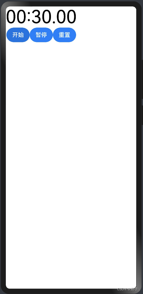
@Entry
@Component
struct TextTimerPage {
  textTimerController: TextTimerController = new TextTimerController()
  @State format: string = 'mm:ss.SS'

  build() {
    Column() {
      TextTimer({ controller: this.textTimerController, isCountDown: true, count: 30000 })
        .format(this.format)
        .fontColor(Color.Black)
        .fontSize(50)
        .onTimer((utc: number, elapsedTime: number) => {
          console.info('textTimer notCountDown utc is:' + utc + ', elapsedTime: ' + elapsedTime)
        })
      Row() {
        Button("开始").onClick(() => {
          this.textTimerController.start()
        })
        Button("暂停").onClick(() => {
          this.textTimerController.pause()
        })
        Button("重置").onClick(() => {
          this.textTimerController.reset()
        })
      }
    }
  }
}
十、TimePicker
描述:时间选择器组件
子组件:无
TimePicker(options?: {selected?: Date})
参数:
参数名
参数类型
必填
默认值
参数描述
selected
Date
否
当前系统时间
设置选中项的时间
属性:
名称
参数类型
默认值
描述
useMilitaryTime
boolean
false
展示时间是否为24小时制,不支持动态修改
事件:
名称
功能描述
onChange(callback: (value: TimePickerResult ) => void)
选择时间时触发该事件
使用案例:
@Entry
@Component
struct TimePickerPage {
  private selectedTime: Date = new Date('12/26/2023 12:30:20')

  build() {
    Column() {
      TimePicker({
        selected: this.selectedTime,
      })
        .useMilitaryTime(true)
        .onChange((date: TimePickerResult) => {
          console.info('select current date is: ' + JSON.stringify(date))
        })
    }.width('100%')
  }
}
十一、Toggle
描述:选择框组件
子组件:仅当ToggleType为Button时可包含子组件
Toggle(options: { type: ToggleType, isOn?: boolean })
参数:
参数名
参数类型
必填
默认值
参数描述
type
ToggleType
是
-
开关类型
isOn
boolean
否
false
开关是否打开,true:打开,false:关闭
属性:
名称
参数
默认值
参数描述
selectedColor
ResourceColor
-
设置组件打开状态的背景颜色。
switchPointColor
ResourceColor
-
设置Switch类型的圆形滑块颜色。
说明:
仅对type为ToggleType.Switch生效。
事件:
- onChange(callback: (isOn: boolean) => void):开关状态切换时触发该事件
ToggleType详解:
- Checkbox:提供单选框样式
- Button:按钮样式
- Switch:开关样式
使用案例:
@Entry
@Component
struct TogglePage {
  build() {
    Column({ space: 10 }) {
      Flex({ justifyContent: FlexAlign.SpaceEvenly, alignItems: ItemAlign.Center }) {

        //Switch:开关样式
        Toggle({ type: ToggleType.Switch, isOn: false })
          .selectedColor(Color.Red)
          .switchPointColor(Color.Gray)
          .onChange((isOn: boolean) => {
            console.info('Component status:' + isOn)
          })
      }

      // Checkbox:单选框样式
      Flex({ justifyContent: FlexAlign.SpaceEvenly, alignItems: ItemAlign.Center }) {
        Toggle({ type: ToggleType.Checkbox, isOn: true })
          .size({ width: 28, height: 28 })
          .selectedColor(Color.Red)
          .onChange((isOn: boolean) => {
            console.info('Component status:' + isOn)
          })
      }

      // Button:按钮样式
      Flex({ justifyContent: FlexAlign.SpaceEvenly, alignItems: ItemAlign.Center }) {
        Toggle({ type: ToggleType.Button, isOn: true }) {
          Text("开关").padding({ left: 12, right: 12 })
        }
        .selectedColor(Color.Red)
        .onChange((isOn: boolean) => {
          console.info('Component status:' + isOn)
        })
      }
    }.width('100%').padding(24)
  }
}
十二、Web
描述:web组件
功能:提供网页显示能力
子组件:无
Web(options: { src: ResourceStr, controller: WebController })
options详解:
- src:网页资源地址
- controller:控制器
属性:
- domStorageAccess:设置是否开启文档对象模型存储接口(DOM Storage API)权限,默认未开启
- fileAccess:设置是否开启应用中文件系统的访问,默认启用
- imageAccess:设置是否允许自动加载图片资源,默认允许
- javaScriptProxy:注入JavaScript对象到window对象中,并在window对象中调用该对象的方法
- object:参与注册的对象。只能声明方法,不能声明属性
- name:注册对象的名称,与window中调用的对象名一致
- methodList:参与注册的应用侧JavaScript对象的方法
javaScriptAccess:设置是否允许执行JavaScript脚本,默认允许
mixedMode:设置是否允许加载超文本传输协议(HTTP)和超文本传输安全协议(HTTPS)混合内容,默认不允许
onlineImageAccess:设置是否允许从网络加载图片资源(通过HTTP和HTTPS访问的资源),默认允许
zoomAccess:设置是否支持手势进行缩放,默认允许
overviewModeAccess:设置是否使用概览模式加载网页,默认使用
databaseAccess:设置是否开启数据库存储API权限,默认不开启
geolocationAccess:设置是否开启获取地理位置权限,默认开启
cacheMode:设置缓存模式
textZoomAtio:设置页面的文本缩放百分比,默认为100%
userAgent:设置用户代理
事件:
- onAlert(callback: (event?: { url: string; message: string; result: JsResult }) => boolean):网页触发alert()告警弹窗时触发回调
- onBeforeUnload(callback: (event?: { url: string; message: string; result: JsResult }) => boolean):刷新或关闭场景下,在即将离开当前页面时触发此回调
onConfirm(callback: (event?: { url: string; message: string; result: JsResult }) => boolean):网页调用confirm()告警时触发此回调
onConsole(callback: (event?: { message: ConsoleMessage }) => boolean):通知宿主应用JavaScript console消息
onDownloadStart(callback: (event?: { url: string, userAgent: string, contentDisposition: string, mimetype: string, contentLength: number }) => void):下载回调
onErrorReceive(callback: (event?: { request: WebResourceRequest, error: WebResourceError }) => void):网页加载遇到错误时触发该回调
onHttpErrorReceive(callback: (event?: { request: WebResourceRequest, response: WebResourceResponse }) => void):网页加载资源遇到的HTTP错误(响应码>=400)时触发该回调
onPageBegin(callback: (event?: { url: string }) => void):网页开始加载时触发该回调,且只在主frame触发,iframe或者frameset的内容加载时不会触发此回调
onPageEnd(callback: (event?: { url: string }) => void):网页加载完成时触发该回调,且只在主frame触发
onProgressChange(callback: (event?: { newProgress: number }) => void):网页加载进度变化时触发该回调
onTitleReceive(callback: (event?: { title: string }) => void):网页document标题更改时触发该回调
onRefreshAccessedHistory(callback: (event?: { url: string, refreshed: boolean }) => void):加载网页页面完成时触发该回调,用于应用更新其访问的历史链接
onUrlLoadIntercept(callback: (event?: { data:string | WebResourceRequest }) => boolean):当Web组件加载url之前触发该回调,用于是否阻止此次访问
- 不支持通用事件
更多详细信息请参考官方文档!
使用案例:
@Entry
@Component
struct WebPage {
  controller: WebController = new WebController();

  build() {
    Column() {
      Web({ src: 'https://blog.csdn.net/weixin_42277946/article/details/135131854', controller: this.controller })
        .onAlert((event) => {
          AlertDialog.show({
            title: 'title',
            message: 'text',
            confirm: {
              value: 'onAlert',
              action: () => {
                event.result.handleConfirm()
              }
            },
            cancel: () => {
              event.result.handleCancel()
            }
          })
          return true;
        })
        .onBeforeUnload((event) => {
          console.log("event.url:" + event.url);
          console.log("event.message:" + event.message);
          console.log("event.result:" + event.result);
          return false;
        })
        .onConfirm((event) => {
          console.log("event.url:" + event.url);
          console.log("event.message:" + event.message);
          console.log("event.result:" + event.result);
          AlertDialog.show({
            title: 'title',
            message: 'text',
            confirm: {
              value: 'onConfirm',
              action: () => {
                event.result.handleConfirm()
              }
            },
            cancel: () => {
              event.result.handleCancel()
            }
          })
          return true;
        })
        .onConsole((event) => {
          console.log('getMessage:获取ConsoleMessage的日志信息:' + event.message.getMessage());
          console.log('getSourceId:获取网页源文件路径和名字:' + event.message.getSourceId());
          console.log('getLineNumber:获取ConsoleMessage的行数:' + event.message.getLineNumber());
          console.log('getMessageLevel:获取ConsoleMessage的信息级别:' + event.message.getMessageLevel());
          return false;
        })
        .onDownloadStart((event) => {
          console.log('url:' + event.url);
          console.log('userAgent:' + event.userAgent);
          console.log('contentDisposition:' + event.contentDisposition);
          console.log('contentLength:' + event.contentLength);
          console.log('mimetype:' + event.mimetype);
        })
        .onErrorReceive((event) => {
          console.log('getErrorInfo:' + event.error.getErrorInfo());
          console.log('getErrorCode:' + event.error.getErrorCode());
          console.log('url:' + event.request.getRequestUrl());
          console.log('isMainFrame:' + event.request.isMainFrame());
          console.log('isRedirect:' + event.request.isRedirect());
          console.log('isRequestGesture:' + event.request.isRequestGesture());
          console.log('getRequestHeader_headerKey:' + event.request.getRequestHeader().toString());
          let result = event.request.getRequestHeader();
          console.log('The request header result size is ' + result.length);
          for (let i of result) {
            console.log('The request header key is : ' + i.headerKey + ', value is : ' + i.headerValue);
          }
        })
        .onHttpErrorReceive((event) => {
          console.log('url:' + event.request.getRequestUrl());
          console.log('isMainFrame:' + event.request.isMainFrame());
          console.log('isRedirect:' + event.request.isRedirect());
          console.log('isRequestGesture:' + event.request.isRequestGesture());
          console.log('getResponseData:' + event.response.getResponseData());
          console.log('getResponseEncoding:' + event.response.getResponseEncoding());
          console.log('getResponseMimeType:' + event.response.getResponseMimeType());
          console.log('getResponseCode:' + event.response.getResponseCode());
          console.log('getReasonMessage:' + event.response.getReasonMessage());
          let result = event.request.getRequestHeader();
          console.log('The request header result size is ' + result.length);
          for (let i of result) {
            console.log('The request header key is : ' + i.headerKey + ' , value is : ' + i.headerValue);
          }
          let resph = event.response.getResponseHeader();
          console.log('The response header result size is ' + resph.length);
          for (let i of resph) {
            console.log('The response header key is : ' + i.headerKey + ' , value is : ' + i.headerValue);
          }
        })
        .onPageBegin((event) => {
          console.log('url:' + event.url);
        })
        .onPageEnd((event) => {
          console.log('url:' + event.url);
        })
        .onProgressChange((event) => {
          console.log('newProgress:' + event.newProgress)
        })
        .onTitleReceive((event) => {
          console.log('title:' + event.title)
        })
        .onRefreshAccessedHistory((event) => {
          console.log('url:' + event.url + ' isReload:' + event.refreshed);
        })
        .onUrlLoadIntercept((event) => {
          console.log('onUrlLoadIntercept ' + event.data.toString())
          return true;
        })
    }
  }
}